initially i went for a more vectored style for my final image using a shadow to communicate the darkness of the father character and the fear of the child character. with finishing this design i have found that the design doesnt work well for my final as it isnt strong enough for a final design. so with reviewing my design and looking at a few artists: magritte, brouqe and other designs i have made new designs looking at shape and shadows, also looking at smoke for the creepy, dark effect.
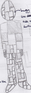
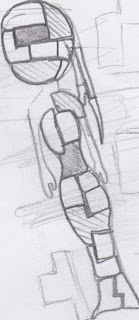
this is a thumbnail for my final designs ideas 1st picture. i have been thinking about making the images in a suit fashion using shapes and different shades of colour having the actual image of abuse showing the story. i aim to have alot of narrative in my final pictures (all 5 of them) communicating the different forms of abuse inside of a family. (there is also a Female version of this thumbnail)
(the female thumbnail same idea)
for this i chose to use shapes. the reason i chose this is because i think that it suits the concept of a dis-functional family which is why they are broken up with different shapes. i think this adds a good dynamic to the design of the ring girl image (view blog to see ring girl vector drawing) i think that the miniture drawings in the rest of the designs have been good to communicate the story. which prompted the idea of having an infographic/editorial design as my final piece for FMP. (more research will support this)
this is the same image (look above) put into photoshop. i like the different opacities of the images to give the whole design more depth i think that this is a good addition to the final design. and i will add this technique to all of my designs.
this is the image that inspired me to add shape to my design.


No comments:
Post a Comment